Children’s Book: Researching Layouts at Barnes & Noble
On Monday night, to make up for desperately lacking any creative drive during the day, my friend and I checked out the local Barnes & Noble to complete a little field work for my New Year’s resolution.
Since I’m still in the fairly early stages of development for this book, there were a couple things in particular I was looking for while trying not to look creepy rummaging through dozens of books in the kid’s section.
First and foremost was the preferred page count for picture books. While there were many outliers, including a number of those I remember from childhood, unless I miscounted over and over, two page counts were used more often than not: 24 pages and 30 pages.
Second, I wanted to see how modern picture books handle text placement. The books I looked at varied widely, but there were two general layouts: incorporating the text into a static section of the image (books with less text) or keeping the text and the picture entirely separate (books with more text), typically on either sold of the fold.
One book in particular caught my interest. It was called This Is Not My Hat and was written and drawn by Jon Klassen. Here’s the cover:
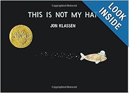
In this short, simple book, the images are almost exclusively in letterbox format, with a white bar lining the top edge of each page.
Text-heavy pages, though, of which there were only a few, followed the same procedure as other books by keeping all the text on one side of the fold for emphasis.
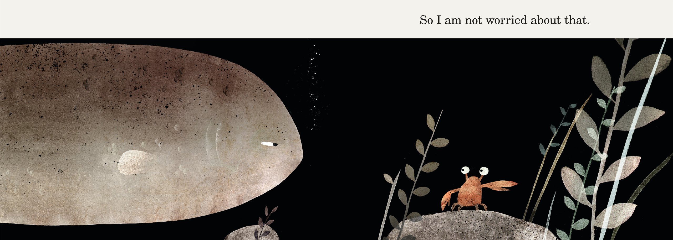
Finally, there was one other thing I was considering while skimming through the books: the art style. None really resembled any other, unless they were by the same artist/authors, and almost every single book had its own unique style or unique method of storytelling. One thing every book did have, though: the imagery consistently moved the story to the right.
By that, I mean all of the movement within the images pushed readers toward the natural page flip. When it was otherwise, the shift in presentation was distinctly worked into the storyline. For instance, in This Is Not My Hat, the last few pages moved instead to the left, but for (truly) good reason.
Next step: Finalize the text, adapting it as necessary to what I’ve learned.
Since I’m still in the fairly early stages of development for this book, there were a couple things in particular I was looking for while trying not to look creepy rummaging through dozens of books in the kid’s section.
First and foremost was the preferred page count for picture books. While there were many outliers, including a number of those I remember from childhood, unless I miscounted over and over, two page counts were used more often than not: 24 pages and 30 pages.
Second, I wanted to see how modern picture books handle text placement. The books I looked at varied widely, but there were two general layouts: incorporating the text into a static section of the image (books with less text) or keeping the text and the picture entirely separate (books with more text), typically on either sold of the fold.
One book in particular caught my interest. It was called This Is Not My Hat and was written and drawn by Jon Klassen. Here’s the cover:
In this short, simple book, the images are almost exclusively in letterbox format, with a white bar lining the top edge of each page.
Text-heavy pages, though, of which there were only a few, followed the same procedure as other books by keeping all the text on one side of the fold for emphasis.
Finally, there was one other thing I was considering while skimming through the books: the art style. None really resembled any other, unless they were by the same artist/authors, and almost every single book had its own unique style or unique method of storytelling. One thing every book did have, though: the imagery consistently moved the story to the right.
By that, I mean all of the movement within the images pushed readers toward the natural page flip. When it was otherwise, the shift in presentation was distinctly worked into the storyline. For instance, in This Is Not My Hat, the last few pages moved instead to the left, but for (truly) good reason.
Next step: Finalize the text, adapting it as necessary to what I’ve learned.